0

I have a Google spreadsheet that lists ratings (1-10) that various participants gave for various topics:

Person  Topic A   Topic B  
------------------------
Claire  4        5
Diane   6        8   
Janet   3        1
Kris    6        3
Susan   8        2
Julie   2        10
LeAnne  3        4

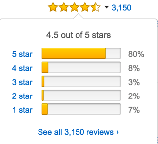
I want to display this data in a bar chart for each topic that breaks down the distribution of those ratings in order from 1-10 (that is, it indicates how many people rated 1, how many rated 2, how many rated 3, and so on). Here's an example of what I want to achieve:

Amazon rating breakdown

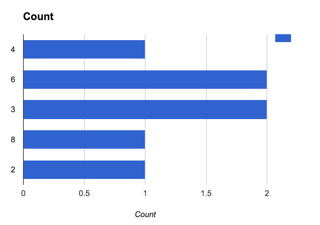
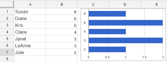
However, what I get in Google Sheets is:

Google Sheets Chart Output

which shows the ratings (rows) in order of occurrence in the spreadsheet, not numerical order. Also, if there are no ratings of a certain value like 1, 5, 7, 9, and 10 for Topic A, I want to have a row for each of those values that has no bar. So this is not very useful.

I looked in the "Chart Editor" > customization options and tried some things, but I couldn't figure out how to get the order of rows to be numerical and also have rows for the numbers that no one used as a rating. The data in the spreadsheet is set as whole numbers (not text).

1
  • The edit rather than clarifying the question changes it so much that invalidates an existing answer that correctly answered the original version. Instead you should revert the question to the previous version and post a new question. Commented Nov 10, 2016 at 15:51

2 Answers 2

1

Sort the source data as shown in the following snapshot:

2
  • I suppose I simplified my question too much. The actual spreadsheet has ratings for a few different topics (in different columns), so it would be impractical to have to sort the source data for this.
    – Mike Eng
    Commented Nov 10, 2016 at 15:32
  • I updated the question to be more representative of my actual data
    – Mike Eng
    Commented Nov 10, 2016 at 15:39
0

So, If data is from A1:C7,

A12:

        QUERY(A1:C7,""select count(A),B group by B"")

This will give the counts of topic A.

A21:

  =ARRAYFORMULA(SORT(IFERROR(VLOOKUP(ROW(1:10),{B13:B17,--TEXT(A13:A17/SUM(A13:A17),""#%"")},{1,2},0), {ROW(1:10), ROW(1:10)*0}),1,0))

This will make a 10 to 0 table from A21:B31. Format the B column as % . So, Make a chart over this table, You'll get what you want.

Your Answer

By clicking “Post Your Answer”, you agree to our terms of service and acknowledge you have read our privacy policy.

Not the answer you're looking for? Browse other questions tagged or ask your own question.