2

I have a column in my spreadsheet that contains only Date values, like:

2014-05-17
2014-06-19
2014-07-16
2014-07-16
2014-07-21
2014-07-21
2014-07-21
2014-07-21
2014-07-21
2014-06-17
2014-06-24
2014-06-24
2014-07-18
2014-07-21
2014-07-21
2014-06-13
2014-06-17

How do I have Google Sheets give me, say, a line chart depicting how many of each date are in the column, like:
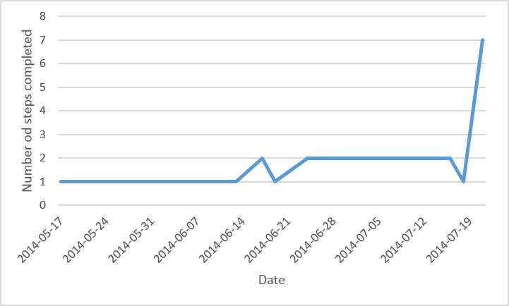
A chart representation of the above data

If the above dates were the only ones I was working with, this wouldn't be a problem. However, there are up to 20 new dates added every day, and none removed. I want this to happen as automatically as possible, without having to add a new cell or update a formula every day.

3
  • @pnuts either skip it or 0
    – Ky -
    Commented Jul 21, 2014 at 19:40
  • New data is added to the column multiple times daily. I want something that will not have to be rewritten and will just display and update this chart every time one is added
    – Ky -
    Commented Jul 21, 2014 at 19:48
  • I made an edit that might help
    – Ky -
    Commented Jul 22, 2014 at 3:50

3 Answers 3

3

You can reproduce the required table using a formula (this will only work on the newest version of Sheets):

=QUERY({A:A,A:A},"select Col1, count(Col2) where Col1 is not null group by Col1 label Col1 'Date', count(Col2) 'Number'",0)

And then reference that output for your graph.

If you are on the old version:

=ArrayFormula(QUERY(IF({1,1},A:A),"select Col1, count(Col2) where Col1 is not null group by Col1 label Col1 'Date', count(Col2) 'Number'",0))

12
  • I'm getting Error: Unable to parse query string for Function QUERY parameter 2: NO_COLUMNCol2
    – Ky -
    Commented Jul 31, 2014 at 19:42
  • Apologies for missing this... are you on the new or old version of Sheets? (green check mark icon at the bottom right)
    – AdamL
    Commented Aug 13, 2014 at 22:25
  • the new one, shiny new material-designed sheets-only browser and all
    – Ky -
    Commented Aug 14, 2014 at 1:06
  • Hmmm, and the first formula is the exact one you have used? Just tested it again and seems to work. If you have adapted it for you spreadsheet, perhaps copy and paste the exact formula you have used.
    – AdamL
    Commented Aug 14, 2014 at 1:58
  • 1
    Forgive me if I have misunderstood your question, but the table will go wherever you enter the formula. That is, if the formula is entered in A1 of some sheet, the top-left cell of the table output will be in A1 of that sheet.
    – AdamL
    Commented Aug 15, 2014 at 3:53
1

Put a column labels at the top of the column

Put in a helper column next to it, and in every cell say

=if(ISBLANK(A1),0,1)

Then choose Data > Pivot Table Report, and enter the data range as A:B

This will create a new tab with the data series you want. You can then create a graph from this.

See an example of this approach here: https://docs.google.com/spreadsheets/d/1UIa4x1A2EWfTJUFUJbM3QkOzp-sHY12w9d7tprVPfDU/edit?usp=sharing

4
  • In all 65,536+ rows?
    – Ky -
    Commented Jul 22, 2014 at 15:18
  • 1
    You need to put the formula in as many rows as you think may realistically by used. Up to 65,536 if you expect that much data - but if you do, you really should be building a solution in a robust database that's scaled for the problem at hand, not using a spreadsheet! Commented Jul 22, 2014 at 15:26
  • But I'm just trying to track which companies I've applied to and when! Currently, there are nearly 100, but I don't wanna put an explicit limit on it
    – Ky -
    Commented Jul 22, 2014 at 15:46
  • 1
    Just put it in as many rows as you might realistically every have. Commented Jul 22, 2014 at 23:46
0

I don't see the need for a helper column:

WA65591 example

The data range for the chart is considerably more rows than shown as in use - and the same goes for the pivot table.

Your Answer

By clicking “Post Your Answer”, you agree to our terms of service and acknowledge you have read our privacy policy.

Not the answer you're looking for? Browse other questions tagged or ask your own question.