3

I have a sheet that contains a list of books, with metadata about those books. Two columns that exist are the library within which the book is stored, and the condition of the book. I'd like to create a chart showing the number of books in each condition, per the library.

The table looks something like this (excluding other non-relevant metadata)

Book     Library     Condition
1        Example1    New
2        Example2    VG
3        Example1    Fair
4        Example3    VG

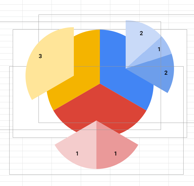
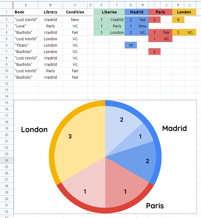
I'd like a table that used the Library column as labels, and had a display for each possible condition in each library. A cluster bar graph would work, but an ideal solution would be something like a double pie chart (where the large slice is the breakdown by the library, and that is the sliced by condition).

1
  • the issue here is that your dataset does not include any numbers which can power the chart directly
    – user0
    Commented Feb 10, 2019 at 21:17

1 Answer 1

5

  • your dataset of A1:C is not in "good" shape for creating a chart, so first, you will need to re-shape it by adding few formulas in auxiliary columns which you can hide when done

  • in cell E1 paste this formula and create a base pie chart. this will create even ratio between Libaries. select primary color for each libary and maximze chart style

    ={"Libaries"\""; {TRANSPOSE(SPLIT(REPT(1&" "; 
      COUNTA(UNIQUE(FILTER(B2:B; B2:B<>""))));" "))\ 
      UNIQUE(FILTER(B2:B; B2:B<>""))}}

  • if you got #ERROR! paste this into E1 cell:
    ={"Libaries",""; {TRANSPOSE(SPLIT(REPT(1&" ", 
      COUNTA(UNIQUE(FILTER(B2:B, B2:B<>""))))," ")), 
      UNIQUE(FILTER(B2:B, B2:B<>""))}}
  • paste this formula in G1 cell to create labels:
    =ARRAYFORMULA(SPLIT(JOIN("×"; 
     TRANSPOSE(REPT(UNIQUE(FILTER(B2:B&"×"; B2:B<>"")); 2))); "×"))
  • then paste this formula in G2 to create dataset for 2nd chart:
    =ARRAYFORMULA(QUERY(TO_TEXT($A$2:$C); 
     "select count(Col3), Col3 
      where Col1 is not null and Col2='"&G1&"'
      group by Col3 
      label count(Col3)''"; 0))
  • after this you will need correction formula which can correct position of the first set of pie slices. paste this in G6 cell and create 2nd pie chart from range G2:H. then play with colors and set color of the correction pie on None
    =IF(SUM(ARRAYFORMULA(QUERY(TO_TEXT($A$2:$C); 
     "select count(Col3) 
      where Col1 is not null and Col2='"&G1&"'
      group by Col3 
      label count(Col3)''"; 0)))>3;
     SUM(ARRAYFORMULA(QUERY(TO_TEXT($A$2:$C); 
     "select Col3, count(Col3) 
      where Col1 is not null and Col2='"&G1&"'
      group by Col3 
      label count(Col3)''"; 0)))*2; 6)
  • when done, overlay 1st chart with 2nd chart
  • then paste this formula in i4 cell (this will be dataset for 3rd chart)
    =ARRAYFORMULA(QUERY(TO_TEXT($A$2:$C); 
     "select count(Col3), Col3 
      where Col1 is not null and Col2='"&I1&"'
      group by Col3 
      label count(Col3)''"; 0))
  • next you need correction again. this time twice. paste this formula in i2 and i7
    =SUM(ARRAYFORMULA(QUERY(TO_TEXT($A$2:$C), 
     "select Col3, count(Col3) 
      where Col1 is not null and Col2='"&I1&"'
      group by Col3 
      label count(Col3)''", 0)))
  • now you can construct 3rd pie chart from range i2:J. again play with colors and hide correction slices. when done overlay it on top of 1st and 2nd chart
  • when done paste this formula in K4 cell (this will be dataset for the 4th pie chart)
    =ARRAYFORMULA(QUERY(TO_TEXT($A$2:$C); 
     "select count(Col3), Col3 
      where Col1 is not null and Col2='"&K1&"'
      group by Col3 
      label count(Col3)''"; 0))
  • and again you need to correct the position with this formula pasted in K2 cell
    =IF(SUM(ARRAYFORMULA(QUERY(TO_TEXT($A$2:$C); 
     "select count(Col3) 
      where Col1 is not null and Col2='"&K1&"'
      group by Col3 
      label count(Col3)''"; 0)))>3;
     SUM(ARRAYFORMULA(QUERY(TO_TEXT($A$2:$C); 
     "select Col3, count(Col3) 
      where Col1 is not null and Col2='"&K1&"'
      group by Col3 
      label count(Col3)''"; 0)))*2; 6)
  • create 4th pie chart from range K2:L, play with colors, hide correction slice, possition it on all previous charts
  • if you want to put up some labels then you can insert drawings and overlay it once again


demo spreadsheet

4
  • 1
    Thanks so much! I'm going to give this a shot later today, but because of the sheer level of detail you put into answering this, I've gone ahead and accepted your answer.
    – Tomas
    Commented Feb 12, 2019 at 15:58
  • I'm having some trouble converting this to use the columns that I have. For me, A is still the book number, but the actual library column is I and the condition is J. Using this in L1 ={"Libaries",""; {TRANSPOSE(SPLIT(REPT(1&" ", COUNTA(UNIQUE(FILTER(I2:I, I2:I<>""))))," ")), UNIQUE(FILTER(I2:I, I2:I<>""))}} Appears to work and gives me the list of libraries. In N1, =ARRAYFORMULA(SPLIT(JOIN("×", TRANSPOSE(REPT(UNIQUE(FILTER(I2:I&"×", I2:I<>"")), 2))), "×")) builds the headers successfully
    – Tomas
    Commented Feb 12, 2019 at 16:13
  • =ARRAYFORMULA(QUERY(TO_TEXT($A$2:$J); "select count(Col3), Col3 where Col1 is not null and Col2='"&N1&"' group by Col3 label count(Col3)''"; 0)) gives me #N/A.
    – Tomas
    Commented Feb 12, 2019 at 16:15
  • @Tomas if you use range A:J every Col2 needs to be Co9 and every Col3 needs to be Col10 - see here: docs.google.com/spreadsheets/d/…
    – user0
    Commented Feb 12, 2019 at 16:38

Your Answer

By clicking “Post Your Answer”, you agree to our terms of service and acknowledge you have read our privacy policy.

Not the answer you're looking for? Browse other questions tagged or ask your own question.