0

I have setup conditional formatting using a green-red percentile color scale.

This works fine until I copy this section down the sheet. When I do this, the numbers in the second section affect the color scale applied to the first section.

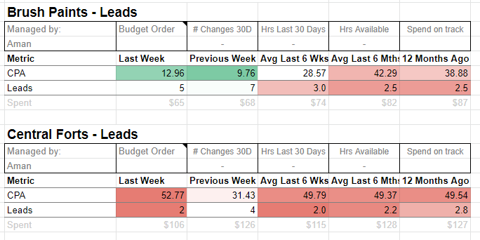
In this screenshot you can see the colors in the "CPA" row in the second section are affected by the values in the first section. All of them are red, but the smallest in that row should be green and the largest red. This is because the conditional formatting is including the numbers from the first section CPA row in its percentile calculations.

Google Sheets screenshot

I'm looking for a way to be able to copy and paste the "template" multiple times down the sheet, and have the the conditional formatting rule apply to each pasted copy, however the conditional formatting in each pasted copy should only consider the values in that specific row.

More info:

Here's a Google Sheet as a demo: https://docs.google.com/spreadsheets/d/1OMA9ps5AHsB6x7t59UuCvsQ_gw3qnXjUeeDizDXgr68/edit?usp=sharing

The report template looks up values in columns A:D and pulls in figures from the data sheet. So by copying and pasting the template (E2:J8) the figures are pulled in for each client.

In the CPA row, the smallest number is green and the largest is red. For the Leads row, the largest number is green and the smallest is red.

In ColA there is a number loop from 1-8. The template should always be pasted in a row with number 1 in ColA.

In case it is helpful, the CPA row will always have a value of 5 in ColA and the Leads row will always have a value of 6 in ColA. (Not sure if this is helpful for using INDIRECT in conditional formatting?)

I'm looking for a conditional formatting formula that will isolate the percentile scale to just that row, even if we copy it down 50 times. From what I've read I think the INDIRECT function might be helpful in the conditional formatting formula, however I can't figure out how to use it when we're copying and pasting down.

(The Google sheet linked is set to "anyone can edit" so If you want to, feel free to duplicate the "report" sheet and edit the duplicate to test a solution.)

1 Answer 1

1

I have found the answer.

You can't set complex rules on a Conditional Formatting Color Scales. The only thing you can set is the range to apply and this range does not accept formulas. So the way to approach this is to set multiple "single color" rules with custom formulas.

Overall solution:

Set the following "single color" rules with custom formulas:

  1. Set a dark red color for the worst number in the row, using a percentile formula.
  2. Set a green color for the best number in the row, using a percentile formula.
  3. Set a lighter red color for any number in the row that is worse than half way between the best and the worst in the row.

Percentile Formulas

We can use the percentile formula to get the top and bottom figures of a range.

e.g. =percentile($F30:$J30,1) This formula would return the highest number (the 100th percentile) from the range F30:J30.

To use the formula in conditional formatting to highlight the highest number for the range F30:J30 we need to turn it into a TRUE/FALSE statement by doing this:

=F30=percentile($F30:$J30,1)

Applying Percentile Formulas to the Whole Range

To apply the conditional formatting down the sheet, we need to set the range as F:J and then set a condition for which rows it should apply to.

In this spreadsheet we only wanted to apply the rules when the value in ColA was 5. The highest number in these rows is the poorest performance, the lowest is best.

So I set this rule to highlight the highest number (100th percentile) in red for every row that has a 5 in ColA:

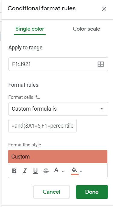
=and($A1=5,F1=percentile($F1:$J1,1))

The setup looks like this:

conditional formatting formula

I then set this formula to highlight the lowest number in green for every row where ColA = 5. =and($A1=5,F1=percentile($F1:$J1,0))

Finally, I wanted to highlight other numbers that weren't good, but weren't the worst. For this I chose not to use percentiles, because they aren't always useful if numbers are grouped closely together.

So I chose to highlight anything that was worse than the halfway mark between the best the worst. This formula is "highest number - (half the difference between highest and lowest number)". =and($A1=5,F1>percentile($F1:$J1,1)-((percentile($F1:$J1,1)-percentile($F1:$J1,0))/2))

This again applied only to rows with 5 in ColA.

Opposite colors for different rows

I set additional formulas to apply to any rows that have a 6 in ColA - with green for the highest number and red for the lowest number.

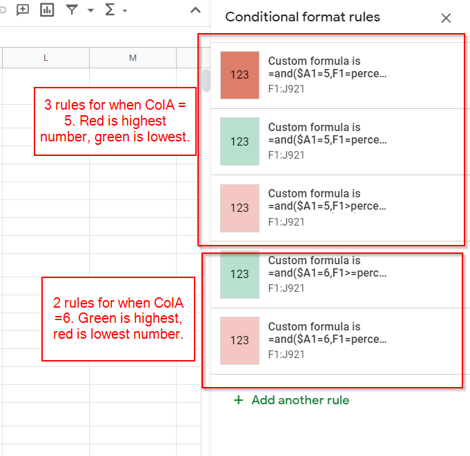
So I ended up with 5 conditional formatting rules:

multiple conditional formatting rules

Conclusion

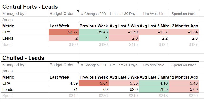
The result is that the numbers in every row are only evaluated against the other number from the same row. This allows us to copy the template down the page over and over again, and the conditional formatting works well.

(I have changed the linked Google Sheet to now having view-only permissions. You can view the solution on the "Report - Fixed" worksheet.)

conditional formatting screenshot

Your Answer

By clicking “Post Your Answer”, you agree to our terms of service and acknowledge you have read our privacy policy.

Not the answer you're looking for? Browse other questions tagged or ask your own question.