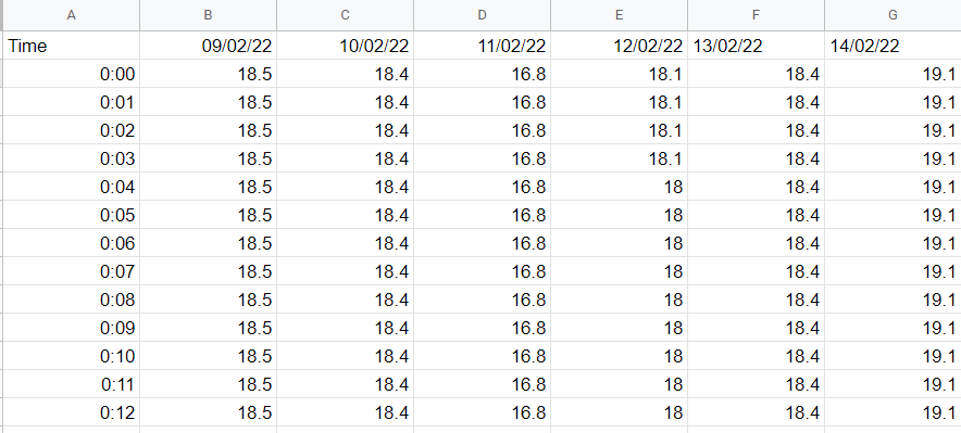
I have a spreadsheet of temperature vs time with multiple columns representing each day:

Is there a way in which I can plot all of the columns of temperature data as one continuous line?
Plot a new column, that has this calculation:
=FILTER({B2:B;C2:C;...},LEN({B2:B;C2:C;...}))
replace the 3 dots with the ranges of the other columns