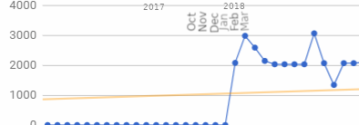
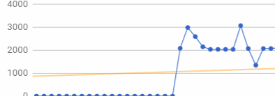
I have a line chart created after data that's stored like this:
     A       B        C        D
1 | 2017   |        | 2018   |      |
2 | NOV    |        | FEB    |      |
3 | 0      | 0      | 2079   | 2079 |

4 | DEC    |        | MAR    |      |
5 | 0      | 0      | 2800   | 2900 |
6 |        |        | 100    |      |
The chart uses values from columns B and D, which can be a =SUM from column A or C.
The chart has these options:
Data range: B1-100,D1-100
Combine ranges: vertically
Plot null values
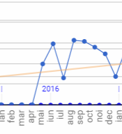
What I wish to do now is also display the month and year on the chart, so I can identify to what period the points belong to. Something like:

I cannot figure out how I would configure the chart in order to display these.


