1

I am trying to plot two different types of data: segmented volumes and rating. In the linked example data sets & charts you will find two different charts that I am trying to combine.

  • The first table has a stacked column (data type A, segmented volume, left axis) and a non-stacked column (data type B, right axis)
  • The second table has a non-stacked (data type A, non-segmented) and a line (data type B)

The goal is to combine the presentation of data type A as a segmented volume (first table) with the presentation of data type B as a line (second table).

Is this type of chart possible in Google Sheets, and if so how do you achieve it?

3 Answers 3

4

Maybe this is what you wanted (the chart is in the example you linked): enter image description here

I used a combo chart, applies column style for all series, but asked only for the "Total" series to be displayed in the right axis. The series displayed in the left axis were stacked by default.

1

not sure if I understood it so is this what you seek?

enter image description here

1
  • In a sense yes. Trendlines do convey a piece of the information, but I am looking at a granularity that is weekly, rather than averaging change. Also, if the trendline was at that granularity, the goal would be to only have the trendline, and remove the rating column. (I did realize that I can change the column's color to match the background though.)
    – mfg
    Commented May 18, 2018 at 18:05
1

Just copy answer from other question, but perfectly work here https://webapps.stackexchange.com/a/155209/274757

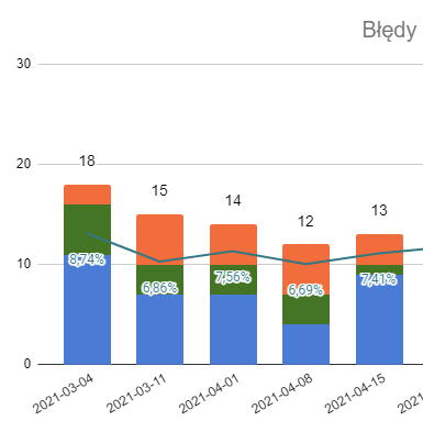
You can insert stacked column chart combined with line.

  1. First choose chart Combined
  2. Add all data and Series
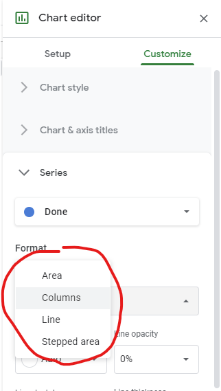
  3. And then customize every Series in details, here:

enter image description here

Result:

enter image description here

Not the answer you're looking for? Browse other questions tagged or ask your own question.