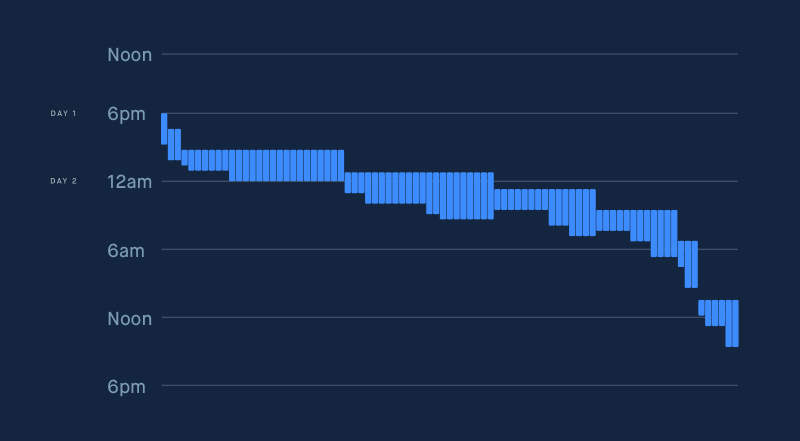
I have two columns in a spreadsheet: A1:A100 has start times, and B1:B100 has duration. I am trying to create a chart that looks something like this, where each row gets a vertical line placed at the relevant start time (column A in the sheet) and the length of the vertical line is determined by the duration (column B in the sheet). Can it be done? I'm relatively new to this and I've tried column charts, waterfall, and scatter, but none seem to be working out very well.
1 Answer
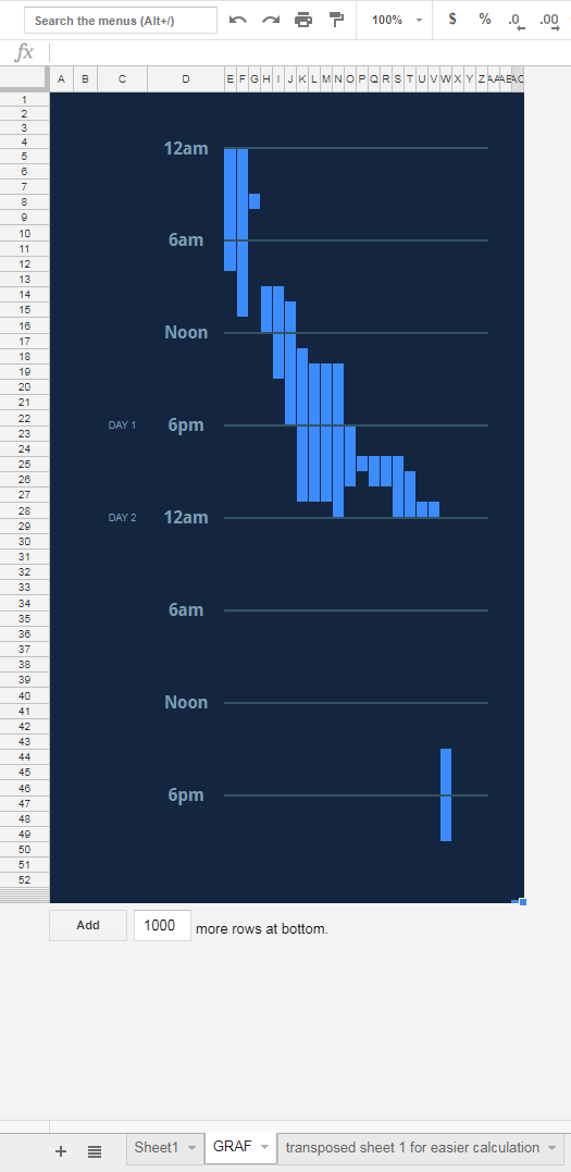
not really, but it can be built (based on the sheet you provided):
-
Wow, this is pretty amazing. Do I understand this correctly? You basically create a formula which checks to see whether each cell should be colored or not based on the transposed sheet. Is that right? Pretty cool! Commented Jul 31, 2018 at 20:05
-


