0

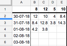
I have a Google Sheet tracking data over days, logging data at different times during the day, example:

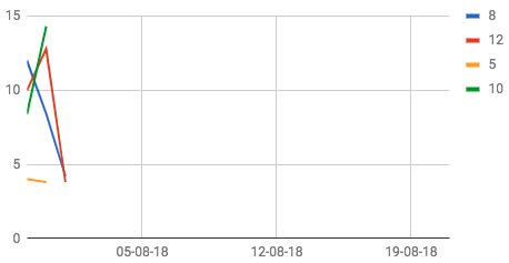
Is there any way that I can have this data represented in a chart as one continuous line tracking throughout time?

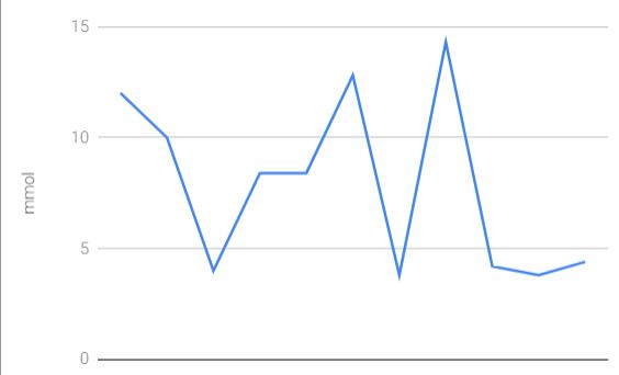
This is an example of what I'm after, having put all of the data in one column. enter image description here
2
  • 1
    Have you thought of trying the stacked line chart?
    – cybernetic.nomad
    Commented Aug 1, 2018 at 16:20
  • Isn't the current chart essentially a stacked line chart? I am essentially wanting one continuous line/data set
    – physicsboy
    Commented Aug 1, 2018 at 16:27

3 Answers 3

0

What you currently have is a line chart.

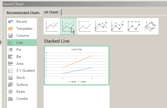
For stacked line charts use:

enter image description here

3
  • I see what you mean, but the chart doesn't come out in a style I am wanting. Please see my updated question for a bit more on what I'm after...
    – physicsboy
    Commented Aug 1, 2018 at 16:41
  • Set all lines except the top most ones to "No Outline", Set the topmost one to the colour and width you want.
    – cybernetic.nomad
    Commented Aug 1, 2018 at 16:50
  • An alternative is to just create a new columns summing all the values and use that for the chart
    – cybernetic.nomad
    Commented Aug 1, 2018 at 16:51
0

I don't think this is possible without changing your data structure:

=ARRAYFORMULA(TRANSPOSE(SPLIT(TEXTJOIN(",",1,B2:E),",")))

Chart over resulting data

0

Can you create a new column that has the data you want, and then chart that?

For example, add a column with the sum of the data on the right, and then chart that column.
That seems more straightforward to me and easier to understand.

Your Answer

By clicking “Post Your Answer”, you agree to our terms of service and acknowledge you have read our privacy policy.

Not the answer you're looking for? Browse other questions tagged or ask your own question.