0

Here's what seems to be a simple common thing in excel/sheets that I can't seem to be able to google in the right way. three columns: timestamp, email, things_done.

I want a chart with time as the X axis, things_done as the Y axis, and a line for each email.

The things_done could be grouped by week or even month and that would be pretty good.

Ideally I would be able to point some tool at this data and be able to do various things with it like choose weather to group by week or month, look at 5-week moving average, etc.

I've been able to sort of achieve this with multiple sheets to get to a pivot table, but the resultant "smooth" chart doesn't want to consistently connect the dots. And in general my setup is very inflexible.

Is there a way (or third-party tool) to go straight from my source data described above to a nice looking chart with the time aggregation of my choosing (and bonus points for ability to add moving average)?

1 Answer 1

0

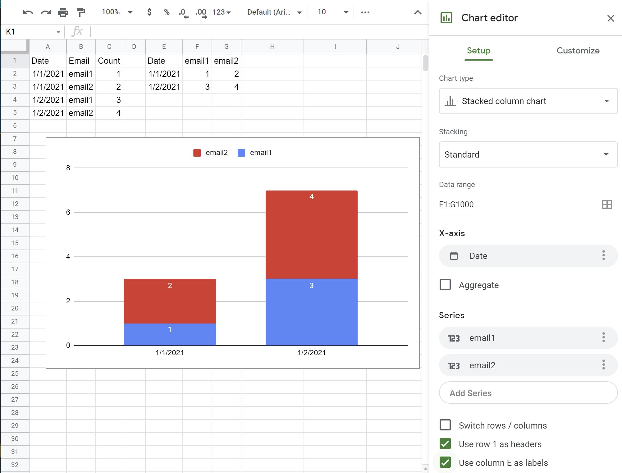
You need to pivot the data before charting it. The pivot formula in the example below is:

=QUERY(A:C,"select A, sum(C) where C is not null group by A pivot B")

You can add another field to use as a filter. For example, if D2 were an email selection, you could use:

=QUERY(A:C,"select A, sum(C) where C is not null"&IF(D2<>""," and B='"&D2&"'","")&" group by A pivot B")

Pivot Example

1
  • Thanks! I get "Circular dependency detected. To resolve with iterative calculation, see File > Spreadsheet Settings.". FYI my columns B and A and different from your example. So I'm using =QUERY('my-other-sheet'!A:C,"select B, sum(C) where C is not null"&IF(D2<>""," and A='"&D2&"'","")&" group by B pivot A") Commented Apr 26, 2021 at 9:13

Your Answer

By clicking “Post Your Answer”, you agree to our terms of service and acknowledge you have read our privacy policy.

Not the answer you're looking for? Browse other questions tagged or ask your own question.